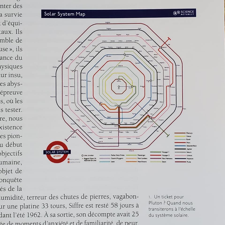
What do you think about when driving home from Lake Tahoe? Trees? Clean air? Skiing? Not too long ago when I drove home from Lake Tahoe all I was thinking about was, “I wonder what the Solar System would look like as a London Underground map?”
The first version was a bit more to scale – train routes, or orbits, were all off center, the spacing between the routes got bigger and bigger the further out from center you got, and even Pluto’s orbit clipped Neptune’s at one point. Even though I’m a stickler for accuracy, it proved too much a mess to work with.
But then I looked at an actual Underground map and realized – it’s not hyper accurate, either. It’s clean and streamlined and drawn to achieve its goal of readability. London looks nothing like that map, yet that map connects London. So, too, then does my map look nothing like the Solar System, yet it’s clear enough to be understood as such.

…and less than a year later after sharing the map all over social media, just like that, it was published!
Techniques & Culture – a science, engineering and design magazine from Paris – loved the map and asked if they could publish it in their next (May) issue. I said of course – provided they send me a copy.
True to their word they sent me a copy. So if you can get your hands on issue #75 and flip to page 13 you’ll see it. 🙂